From Blocky to Flowing: How I Turned Analyst Sentiment into a River of Emotion in ChatGPT
Visualizing data is an art. Some people paint landscapes—I make heatmaps of earnings call sentiment. Same thing, right?
But here’s the thing: when I first mapped analyst sentiment, it looked… well, blocky. Like a game of Tetris where emotions were awkwardly stacked. I wanted something smoother, more natural, and less like a spreadsheet.
So, with the help of ChatGPT, a few well-placed prompts, and sheer determination, I transformed my rigid heatmap into something fluid, organic, and (dare I say?) kind of beautiful (and I stress kind of). This is the story of how I turned data into an emotional river.
Step 1: The Blocky Beginnings
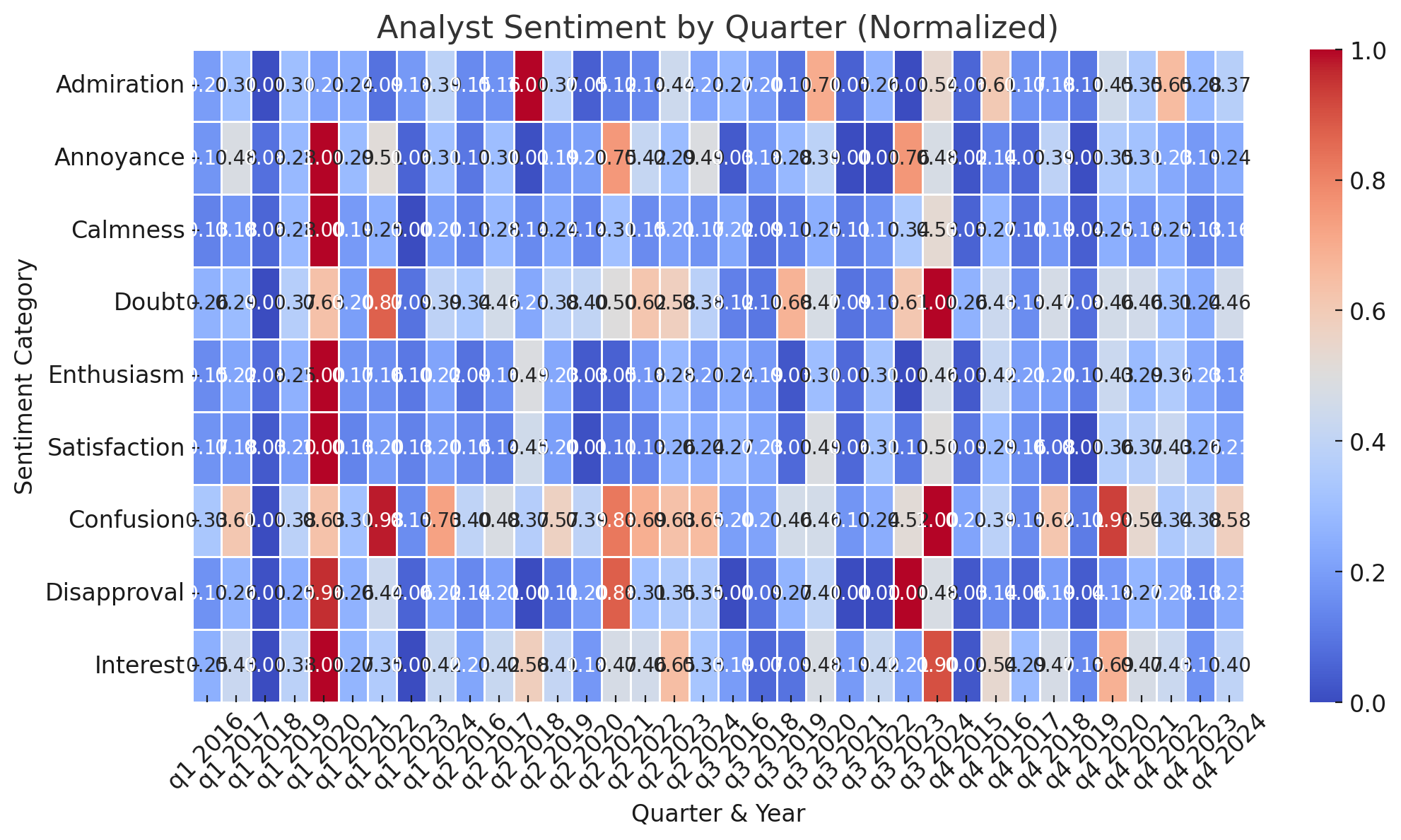
First up—the classic grid heatmap.
This was my “before” picture. It had a job to do: track sentiment across earnings calls, quarter by quarter, category by category. It was precise. It was clear. But it also looked like it was made out of LEGOs.
So, I asked ChatGPT:
“Can you make it smoother and less blocky? I want it to look like water flowing.”
Because nothing says “earnings call analysis” quite like a Zen waterfall of sentiment.
Step 2: Softening the Edges
Next, I moved to a smoother gradient-style heatmap.
ChatGPT took my request and worked its magic. Suddenly, the colors weren’t just awkwardly sitting next to each other—they were blending. It was less “pixel art” and more “modern data visualization.”
At this point, I was feeling pretty fancy. But I wanted more. So I asked:
“Is there a nifty graphic you can add in?”
ChatGPT cheerfully obliged. The chart got shinier, smoother, and 40% more aesthetically pleasing. But I still wasn’t satisfied – I wanted it to flow
Step 3: A Flowing River of Sentiment
Finally—the smoothest, most organic version.
At this stage, the chart looked less like data and more like an emotional mood ring. The sentiment wasn’t just appearing—it was flowing, like a financial version of the Northern Lights.
But because I’m nothing if not picky, I had one last tweak in mind:
“Ahh, nice. Can you make the colors bleed together more?”
Boom. That was it. The colors now drifted into one another like whispers at a shareholders’ meeting. It was calm, seamless, and just chaotic enough to feel natural.
Why This Matters (Beyond Just Looking Cool)
The way we visualize data impacts how we understand it.
• A blocky heatmap makes emotions feel rigid, like they happened in separate little boxes.
• A flowing visualization makes it clear that sentiment shifts naturally over time—just like actual emotions.
With a few clever prompts and some AI-powered artistic direction, I turned a stiff grid into a river of sentiment. And now, every time I look at it, I feel like I should be meditating to the soft sound of earnings calls in the background.


